
Day 15 Advent Calendar: Bar Charts and Pie Charts
- Jacob
- Dec 15, 2025
- 2 min read

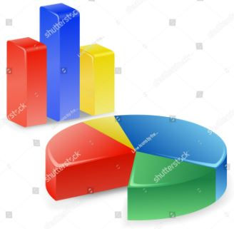
Interpreting Bar Charts and Pie Charts for Supermarket Deals.
Reading colourful charts is a Skill that Counts.
Supermarkets often use charts to show savings and popular deals.
A supermarket shows a chart of how £100 is spent during a Christmas shop:
Food 45%
Drinks 25%
Gifts 20%
Other items 10%
Step 1:
Check the total adds to 100%
45 + 25 + 20 + 10 = 100
Remember,100% (per cent) will not always add up to 100, but to keep this example easier to follow, we will use 100.
Once you have the Skill that Counts, other quantities can be used.
If you need any resources to build this Skill that Counts, drop me an email or leave a comment for FREE RESOURCES ON DATA REPRESENTATION.
Step 2:
Work out the value of the food spend.
45% of £100 = £45
Step 3:
Work out the value of the drinks spend.
25% of £100 = £25
If you need any resources to build this Skill that Counts, drop me an email or leave a comment for FREE RESOURCES ON DATA REPRESENTATION.
Step 4:
Compare two sections
Food costs £45
Gifts cost £20
Food costs £25 more than gifts
Skills that Count Check
Always identify what the full amount represents.
Percentages show parts of a whole.
Bar charts compare amounts.
Pie charts compare proportions.
The Skills that Count
Being able to interpret charts helps you understand spending patterns, spot trends and make informed choices during Christmas shopping.
If you have Microsoft on your device, open an Excel document and toggle the graph functions to help bring data to life. Share your results in the comments.

Comments